Client
Chelsea Football Club
Service
Color Design / Apparel Graphics
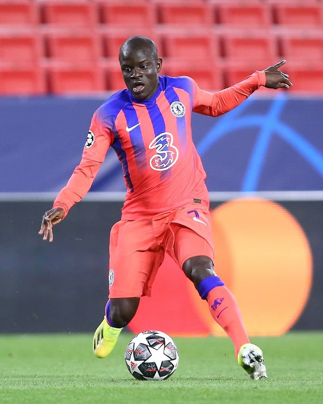
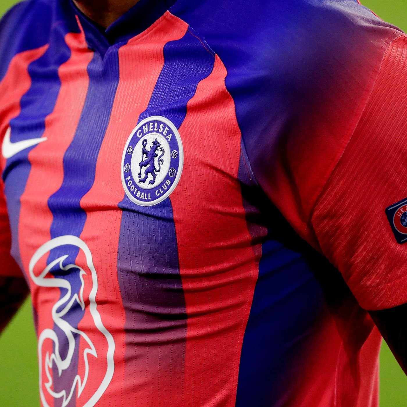
This alternate kit for the 2020-21 season combines vintage club colors, Nike sneaker heritage, and a dose of 1990s nostalgia to create a fresh look. It’s part of a wider Nike seasonal direction which celebrates jersey culture and the iconic Air Max archives. This Blues’ design was heavily influenced by the much-loved original Air Max 180, a shoe which was first released in 1991 and also shares the inspirations of the Chelsea kits of the era. The colors shine through in a third kit which takes all those influences and creates a sharp, modern football kit. The primary color is ember glow, with ultramarine blue playing a strong supporting role.
To everyone at Nike Global Football Apparel that was a part of this - muchas gracias.
Heavily inspired by the Air Max 180 Ultramarine, I created a visual center that would be used throughout the entire collection. This included custom numbers, letters, logos, and icons that further tell the story behind the apparel pieces.
The graphic direction and placement of gradients was heavily informed by the cutlines of the garment. I wanted to accentuate the unique panelling, cutlines, and diverse engineered knit languages that made the construction of this kit so special.
The training apparel continues the same color direction, making sure to bring forth the blue, and highlight the ember glow. The custom Chelsea FC wordmark was heat debossed into the tape for some subtle branding and clean graphic application.
Staying true to the vision of “TO THE MAX”, another kit was proposed, which ultimately launched as its own jersey with some supporting apparel pieces.


