The Nike direction for this season was to hyper focus on the local culture of our clubs. I had the good fortune of traveling to Mexico City and collaborating with 3 graphic design students from the Universidad Nacional Autónoma de México. We also had local support from the talented football design agency, Barrilete Cósmico. Our full days of guided tours throughout the campus and workshop sessions were pivotal to discovering thee true nature of the unique relationship between university and football club. The amount of rich history and culture that comes from this iconic institution and stadium was massively inspiring.
To everyone and Nike Global Football Apparel that was a part of this - muchas gracias.
Client
Pumas UNAM
Service
Storytelling / Art Direction / Color Design / Apparel Graphics


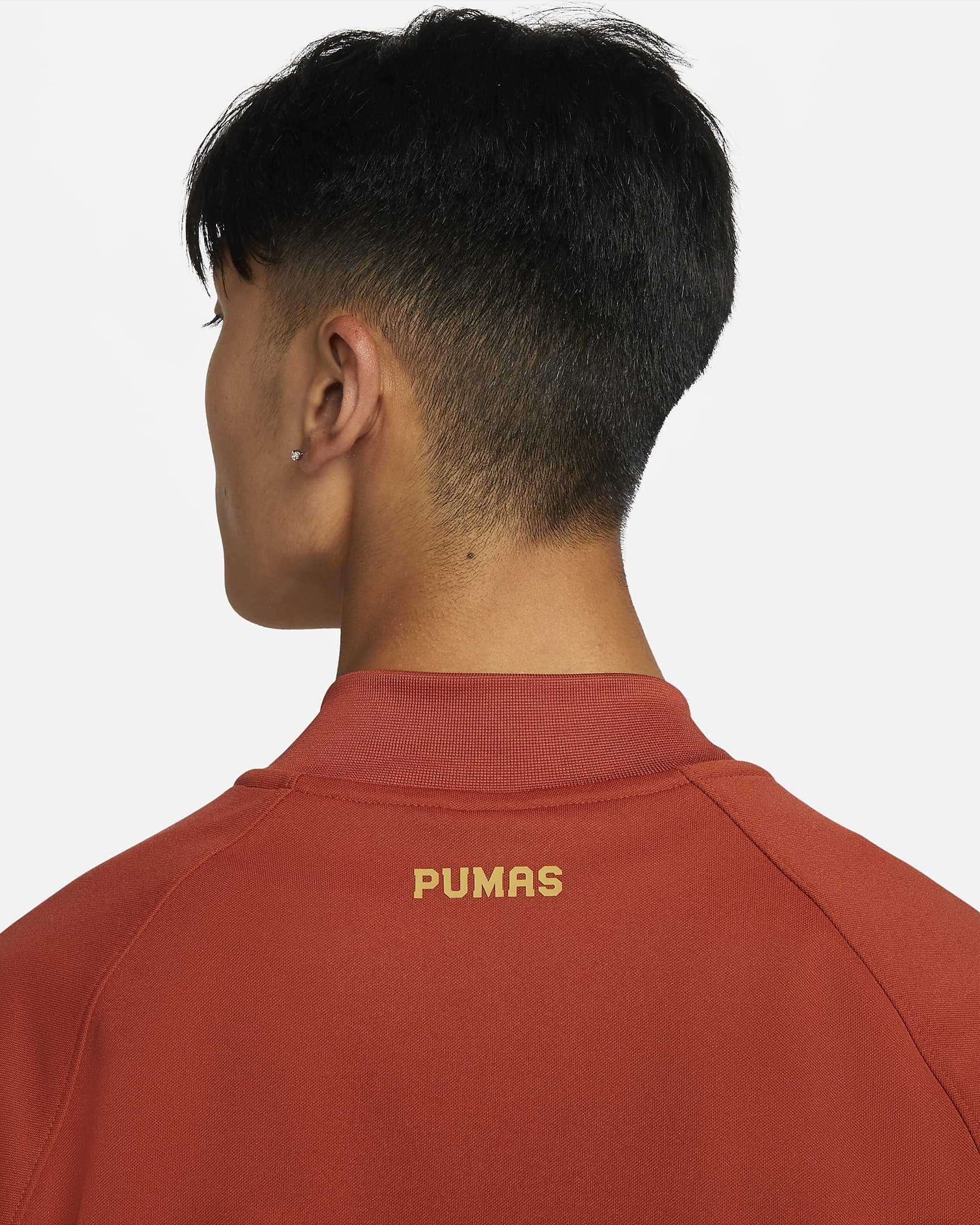
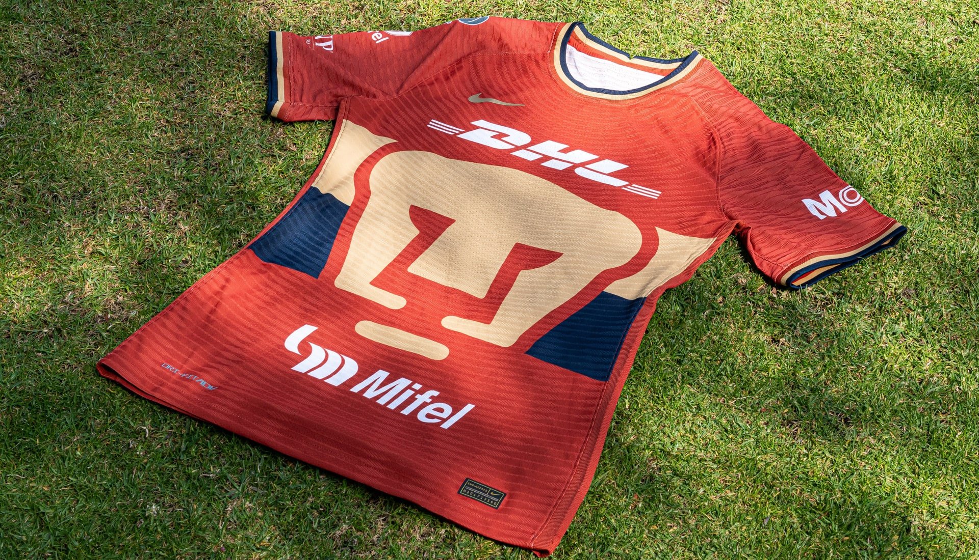
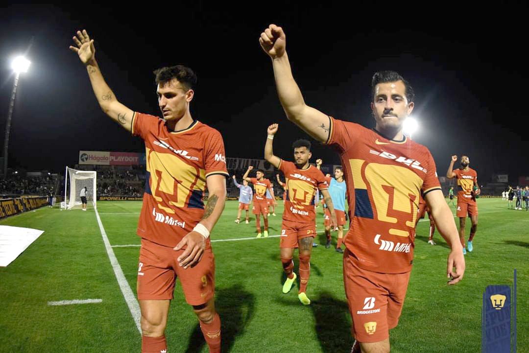
Pumas UNAM has historically used the same 3 colors of white, navy, and gold. The challenge was to provide a fresh color perspective that was authentic to the area, worked with their current palette, and paid homage to the indigenous land where the game is played. During our observations and conversations it was clear that a rich clay aesthetic was the solution. For centuries, this color has been a significant part of Mexican culture and rightly fitting for a special alternate kit.


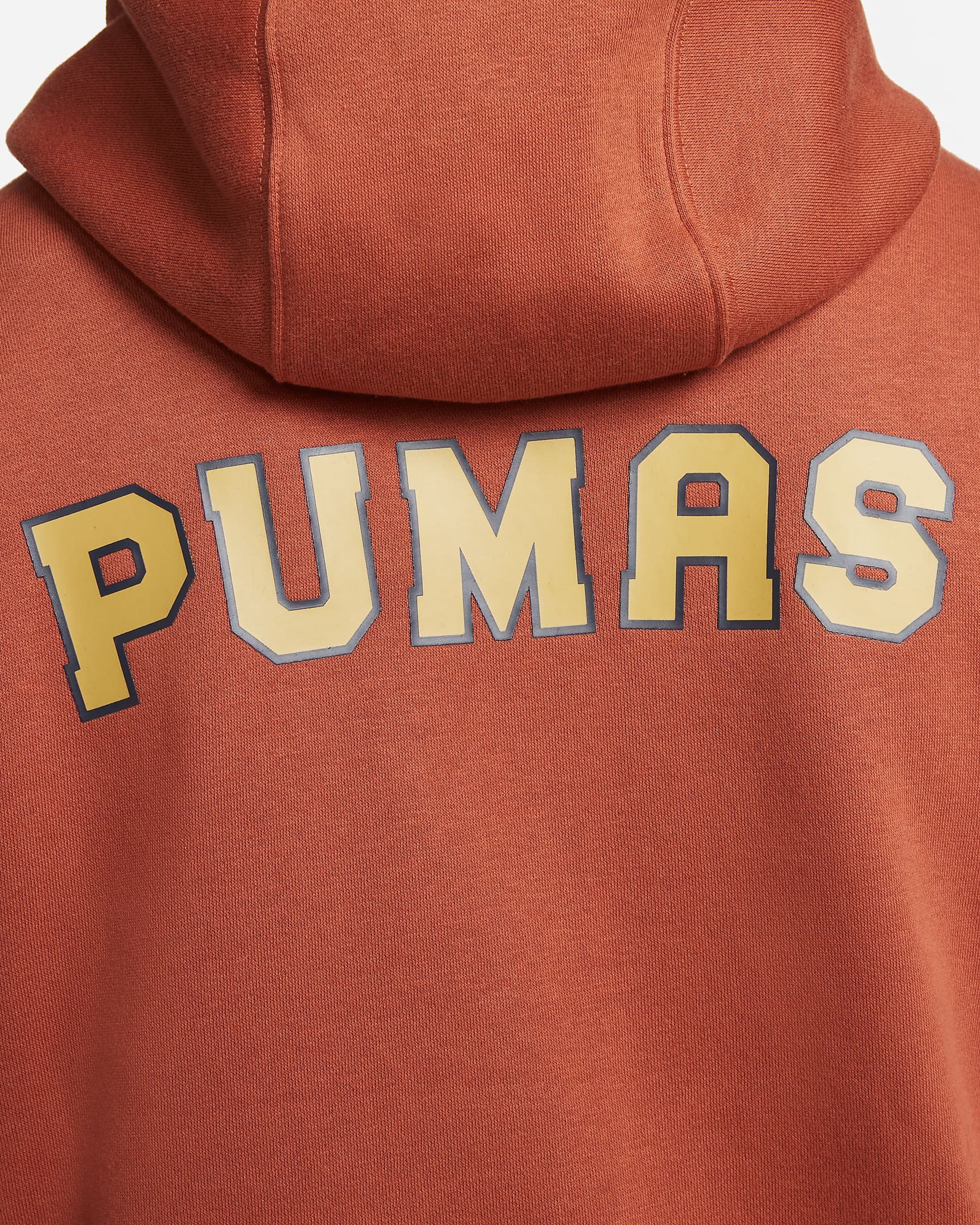


I created a seasonal PUMAS wordmark to be used across the collection, mostly in fanwear product. The type is inspired by the “U” logo of the university.