Client
KNVB Women’s 2022 Euros Collection
Service
Storytelling / Art Direction / Color Design / Apparel Graphics
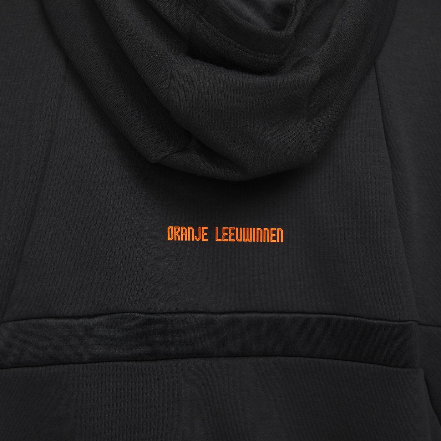
#oranjeleeuwinnen
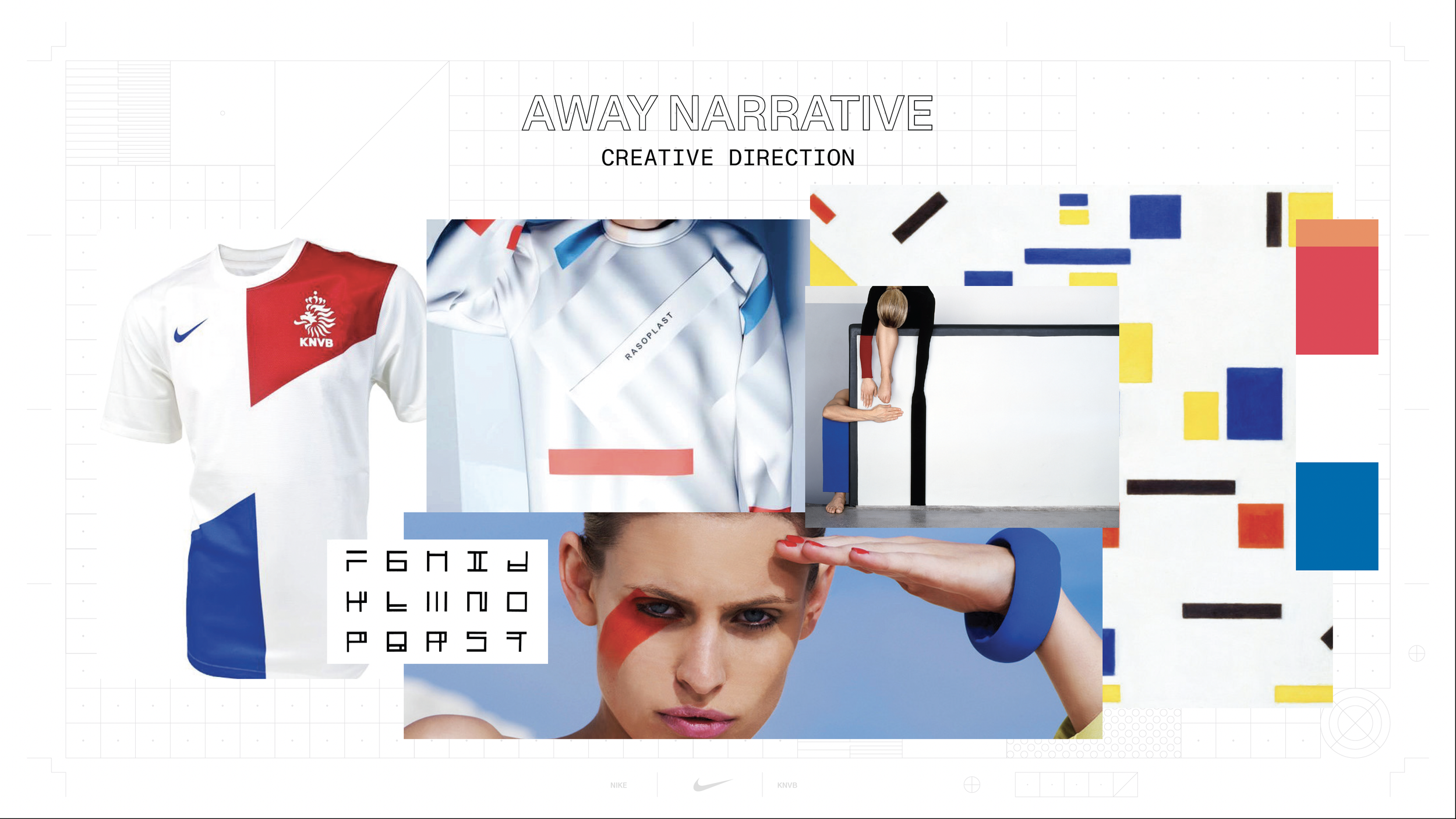
Hup Holland! While researching the women’s Dutch team I discovered a healthy balance of intense strength and playful joy throughout their on field personas and off pitch style. This team won the Euros in 2017 and moved the needle forward for women’s football worldwide. The collection draws inspiration from De Stijl, a proudly Dutch art movement that also had a huge impact on global culture. It advocates the use of pure abstraction and universality by reducing to the essentials of form and color. It simplified visual compositions to vertical and horizontal, using only black, white and primary colors.
To everyone at Nike Global Football that was a part of this - muchas gracias.

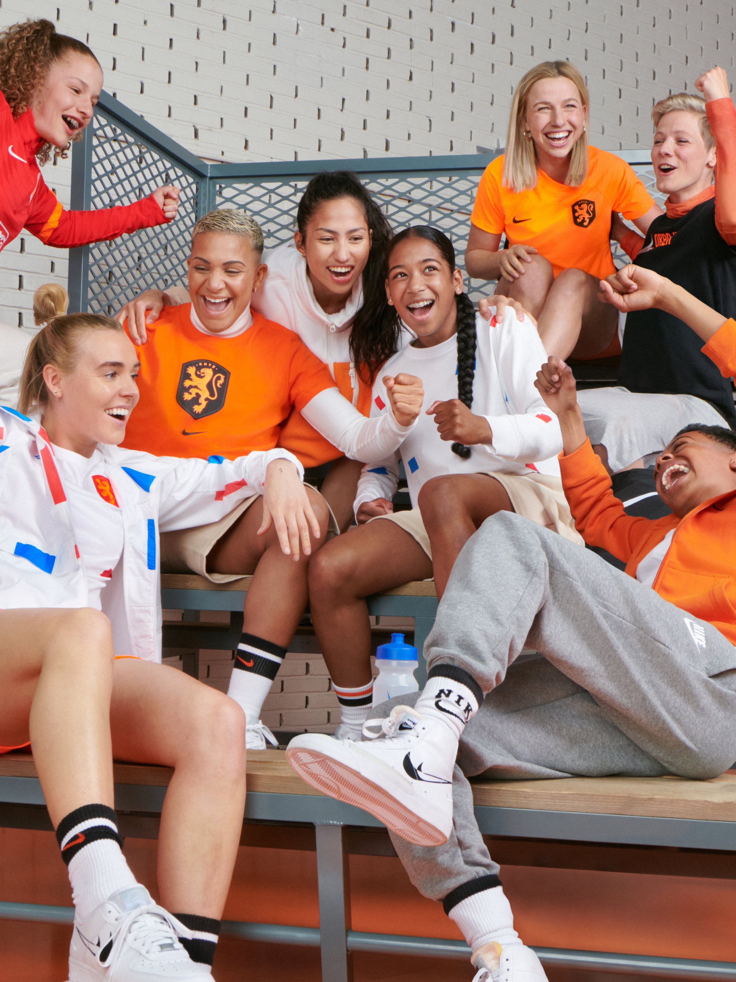
The home kit gives the country’s classic orange a new edge with a powerfully bright orange — complete with black trim for a bold and strong framing of the chassis.

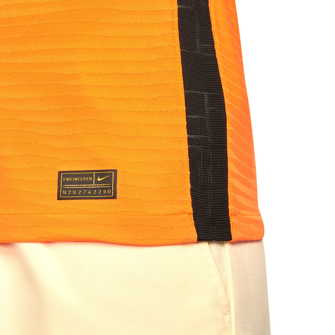


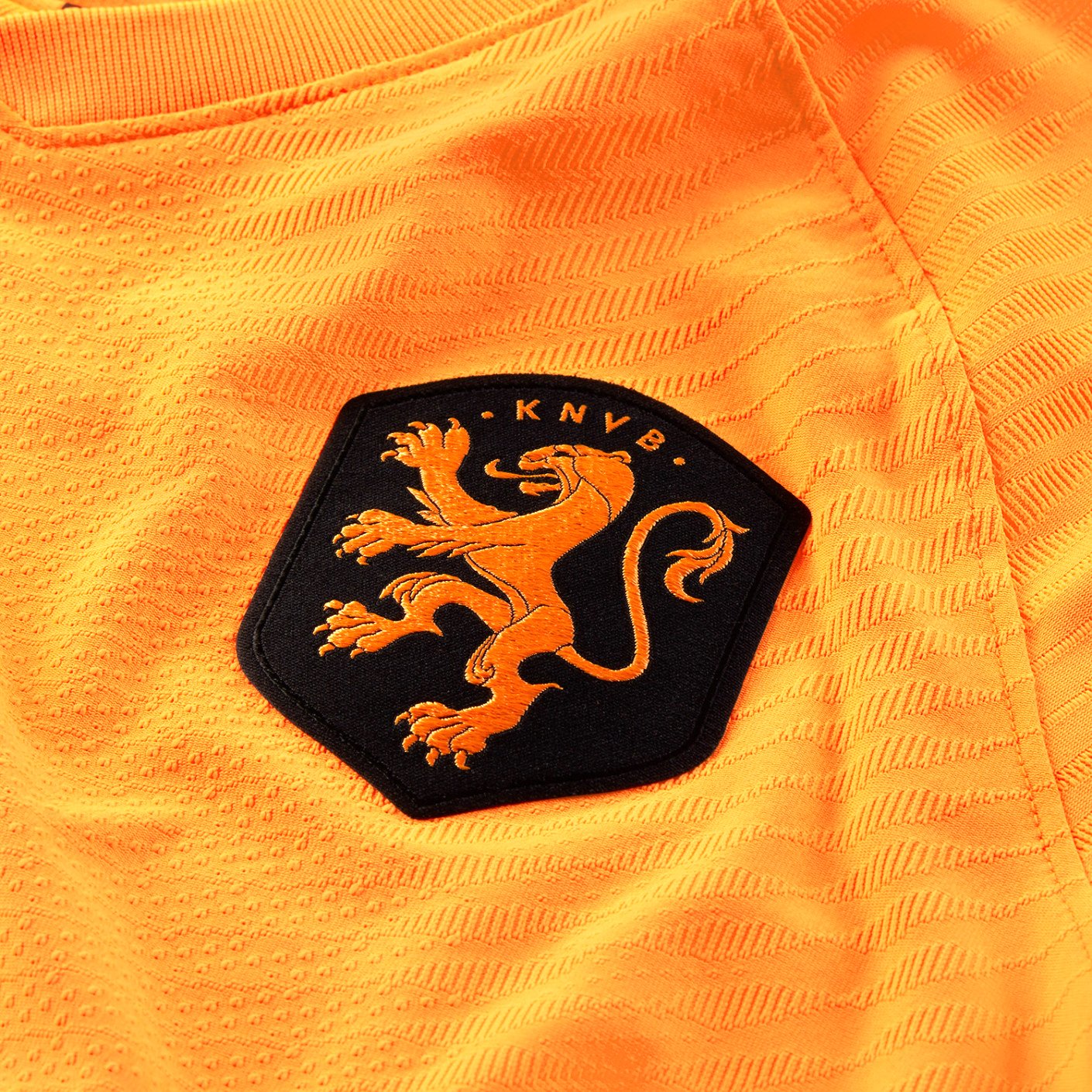
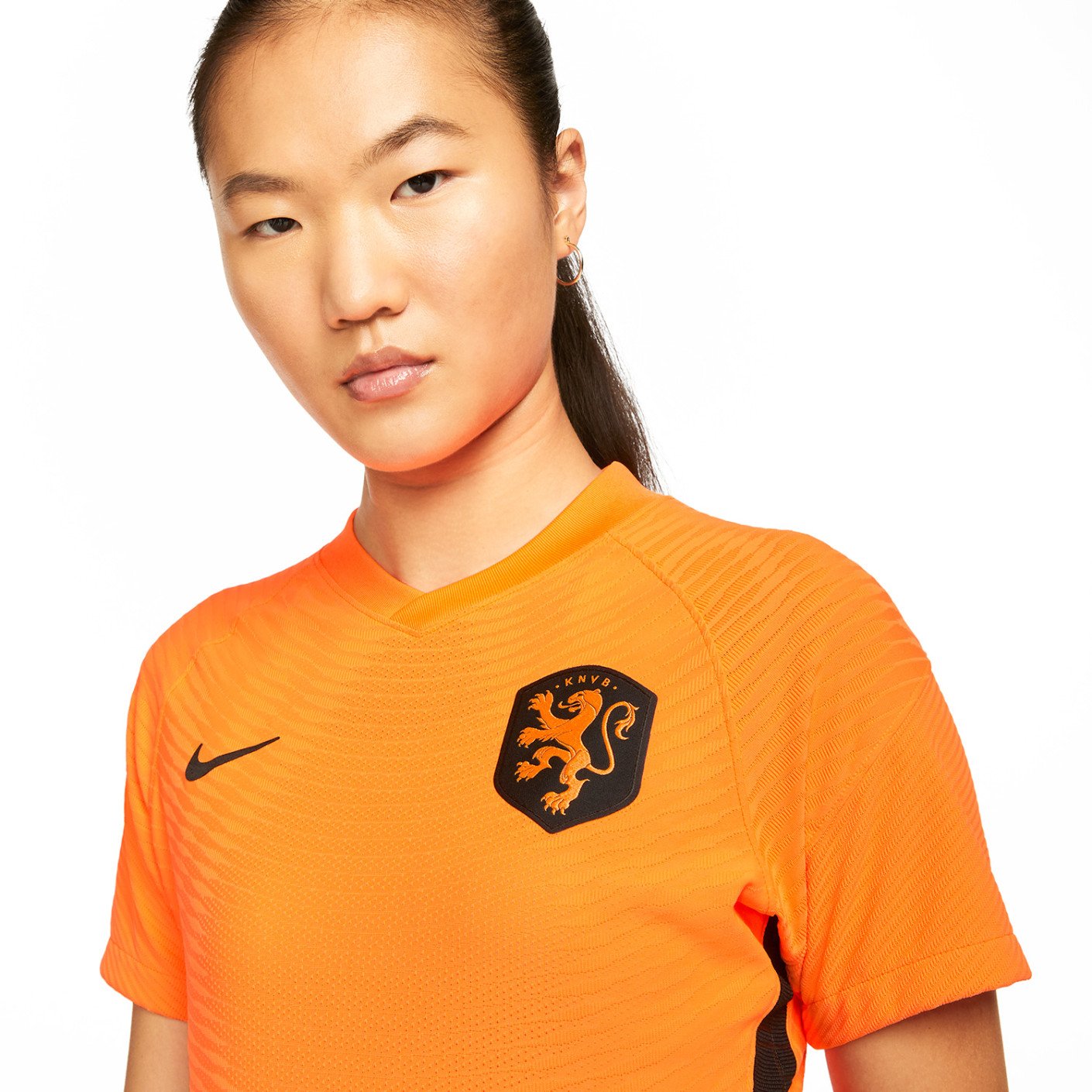

I created a pattern inspired by De Stijl which was heat debossed on the black side stripes of the kit. Staying true to the team’s name Oranje Leeuwinne (Orange Lionesses), I created a inner pride graphic of a lioness in the way of De Stijl.


Custom letters and numerals where created for the kits. Inspired by the De Stijl, I found a way to simplify the shapes while also focusing on mostly vertical and horizontal movements in the forms. An extra layer of dimension and storytelling was added to the numbers by adding a print through clear gloss application.
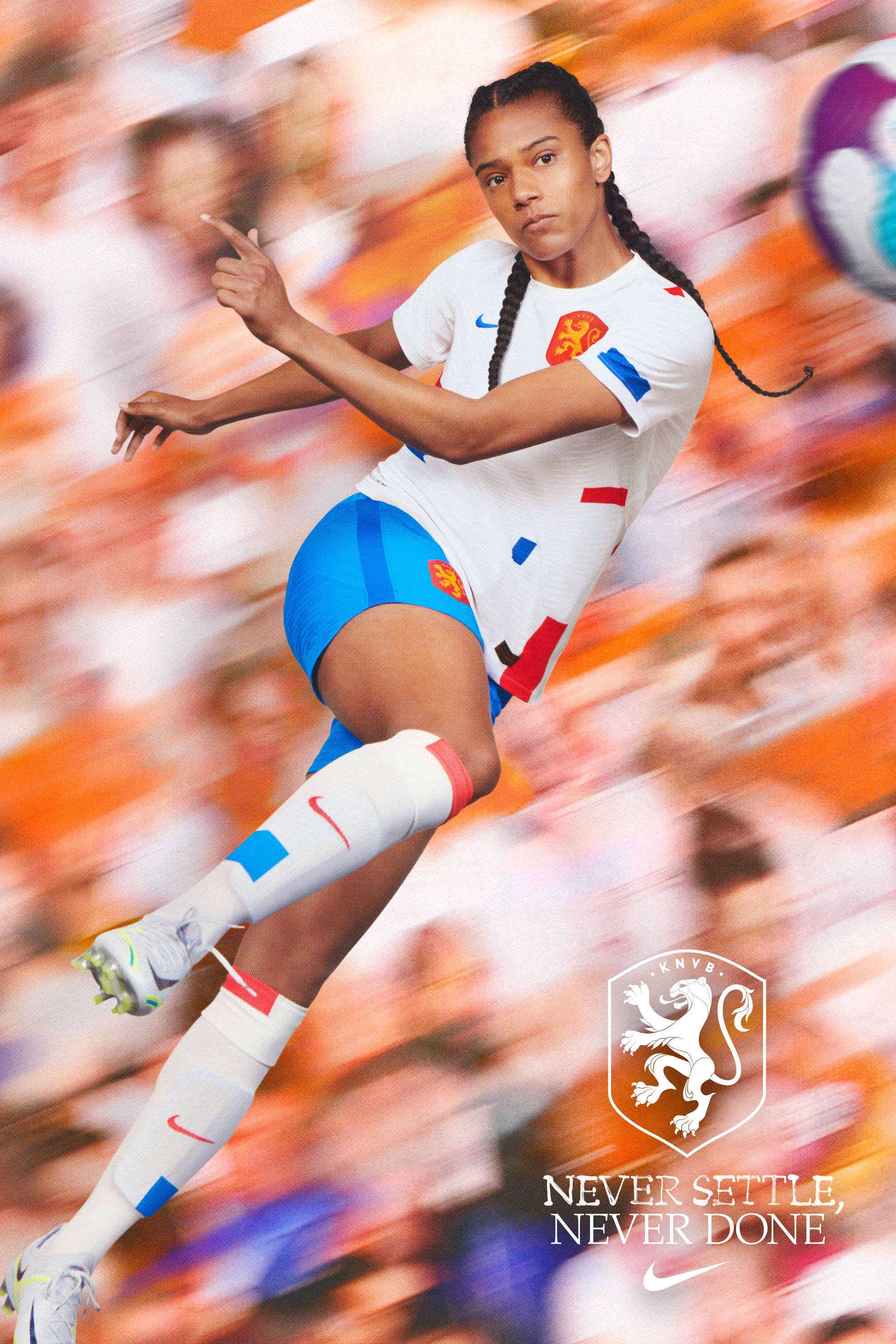


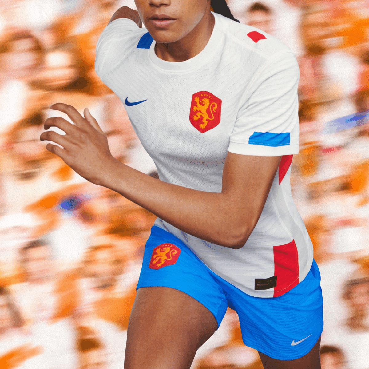
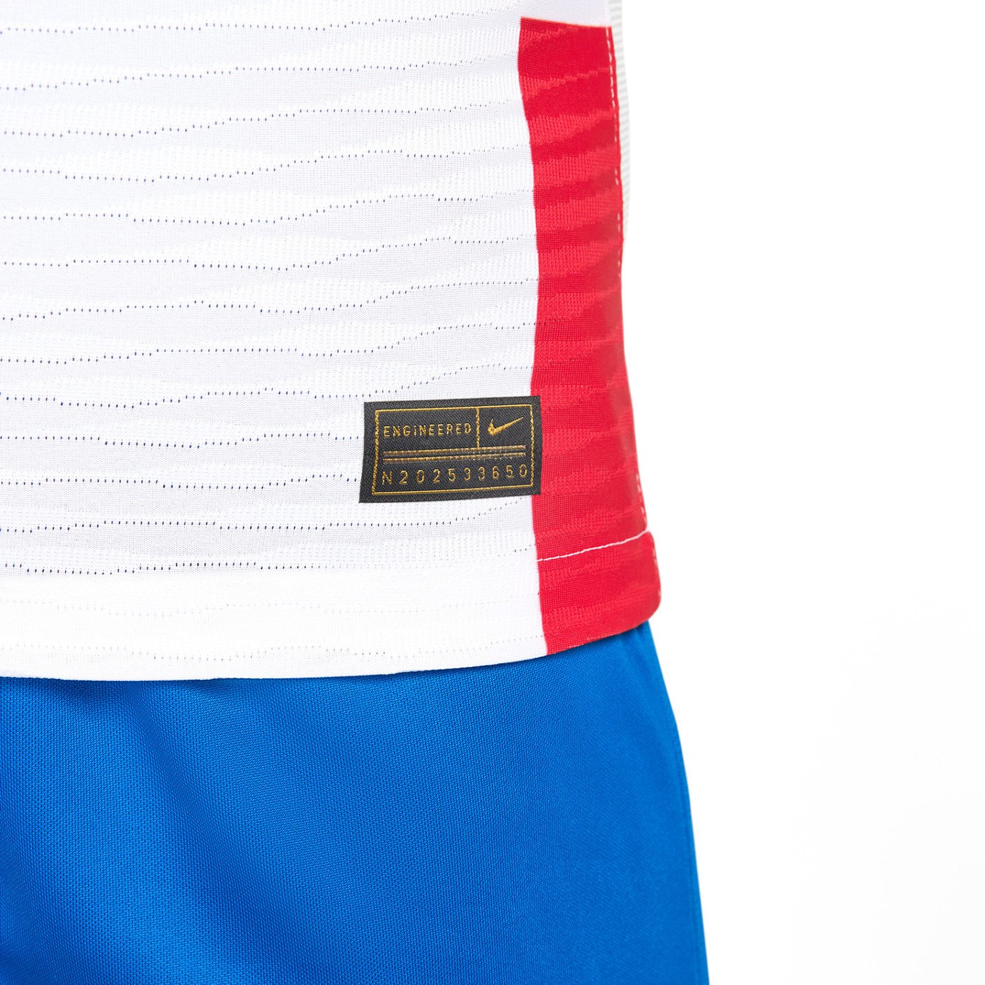
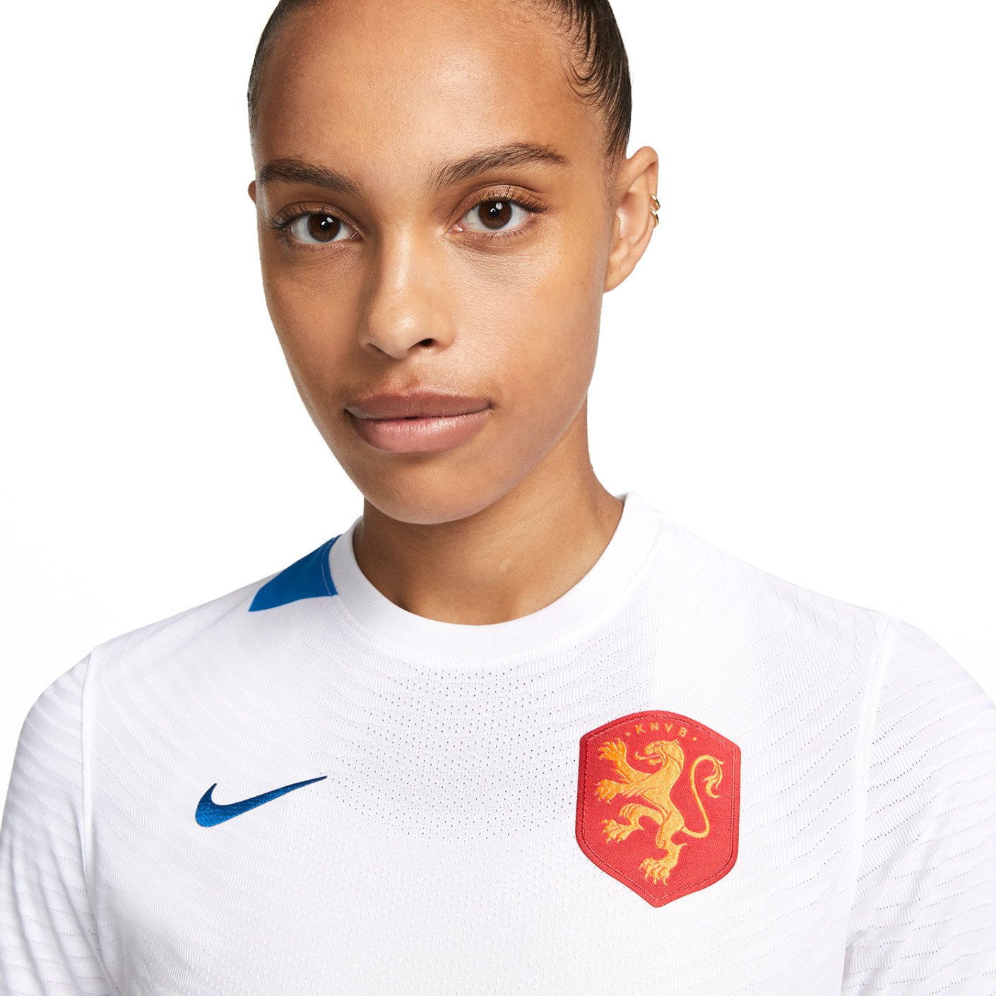
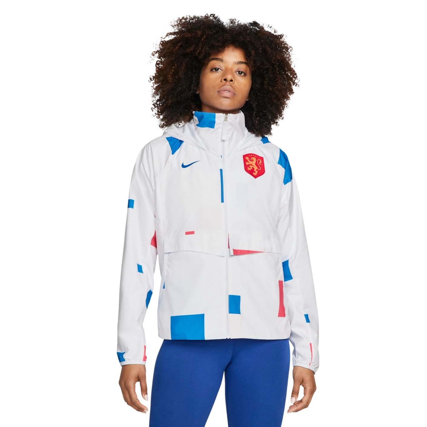
The Netherlands away kit also draws inspiration from De Stijl. I color blocked blue and red squares or rectangles that are precisely placed on the jersey to achieve the art movement's reductive aesthetic. It features the colors from the Dutch flag while adding subtle touches of the bright orange, staying true to the power of the Oranje Leeuwinnen. For the inner pride I recreated the Dutch Queen’s crown through the lens of De Stijl.


For the training styles of the collection I wanted to bring a more rugged and crafted interpretation of De Stijl into the prematch top. Practice gear became flooded with red and popped with the bright orange The side stripes were detailed with the “Oranje Leeuwinnen” wordmark in a heat deboss technique.


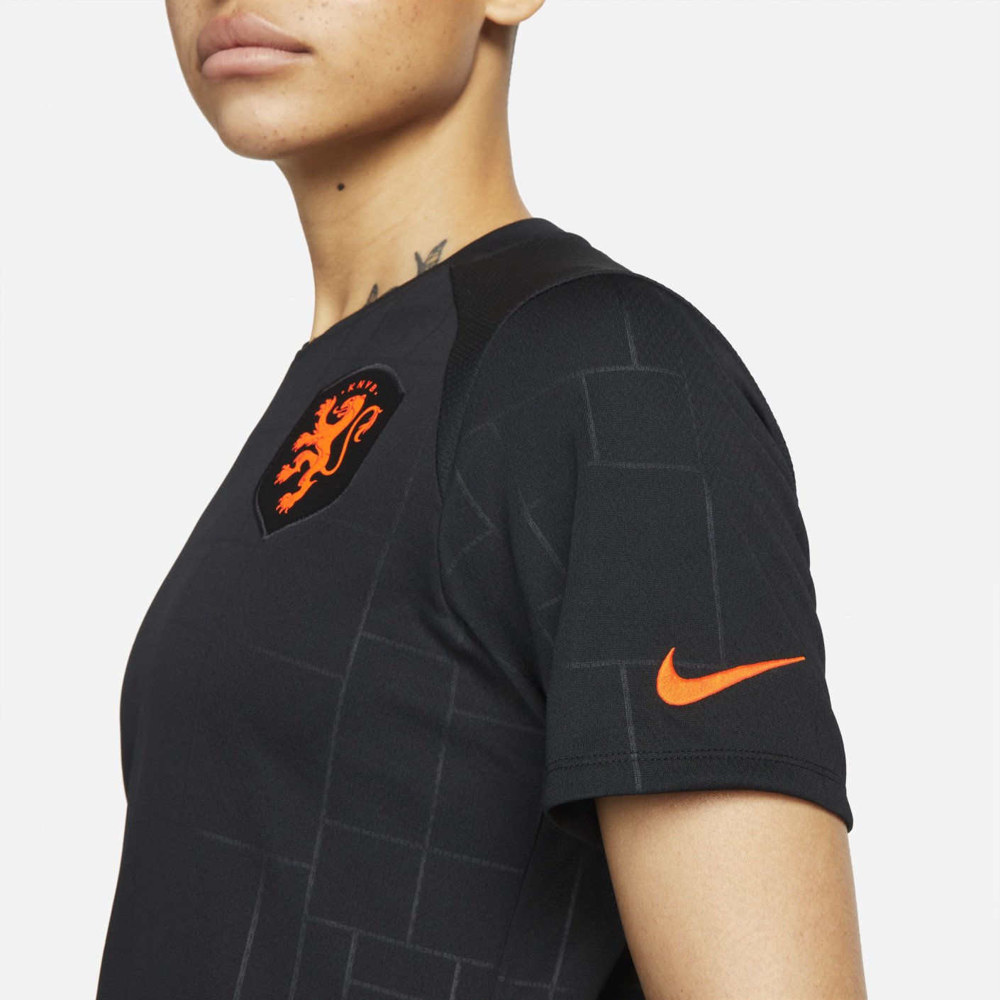
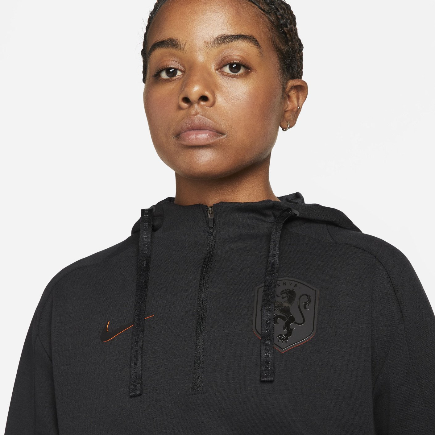


The fanwear collection pushed application methods and details in a fresh way with the addition of some high density color reveal in the branding and more heat debossing for subtle detail and textural interest. I used a lot of black which has incomparable versatility and wearability.