

Client
Sioux Falls City FC
Service
Strategy / Branding / Apparel Graphics / Social Media Templates
#thisisourcity
Sioux Falls City Football Club is the first women’s elite soccer club in South Dakota. They're a community focused amateur soccer club that strives to provide the highest level of developmental soccer opportunities for elite women in the Sioux Falls region. During our strategy sessions we focused on the purpose of the club, knowing it can be more than just a team, more so a brand that positively contributes to the community, on and off the pitch. For their inaugural season, SFCFC did an amazing job standing up for social causes that are important to a healthy society, ultimately being named Franchise of the Year in the Northern Conference of the WPSL. Through support and collaboration with community-based businesses and organizations, they uphold the values of authenticity, integrity, and purpose.
To everyone at SFCFC that was a part of this - muchas gracias.


During our strategy sessions, the founders chose to stay away from a crest that could resemble a more traditional shield badge. SFCFC was always clear that they’d be an inclusive team, so I felt a circular shape would best fit the design. It was obvious the founders wanted to transform and create positive change for their athletes and community. Inspired by the delta symbol that signifies change or transformation, I created a mark that embodied the club’s vision and could stand strong on its own in any environment.


The colors where inspired by the earth and sky of South Dakota. Sioux Falls is well known for its pink quartzite and we felt it necessary to pay homage to such a special part of the local culture.


For the white kit I continued the idea of transformation by using the team colors in a dynamic and fluid expression, coupled with the perennial strength of black plus white. Lots of minor details and supporting brand graphics where dispersed throughout the jersey, providing micro narratives to the visual direction. All player photos were taken by Travis Gallipo, a local Sioux Falls photographer.


With the blue kit I wanted to highlight the concept of consistency in the club’s communication. We agreed that repetition would lead to significant transformation. I drew inspiration from their crest’s DNA and created a pattern that celebrates their colors and honors classic football jersey aesthetics.


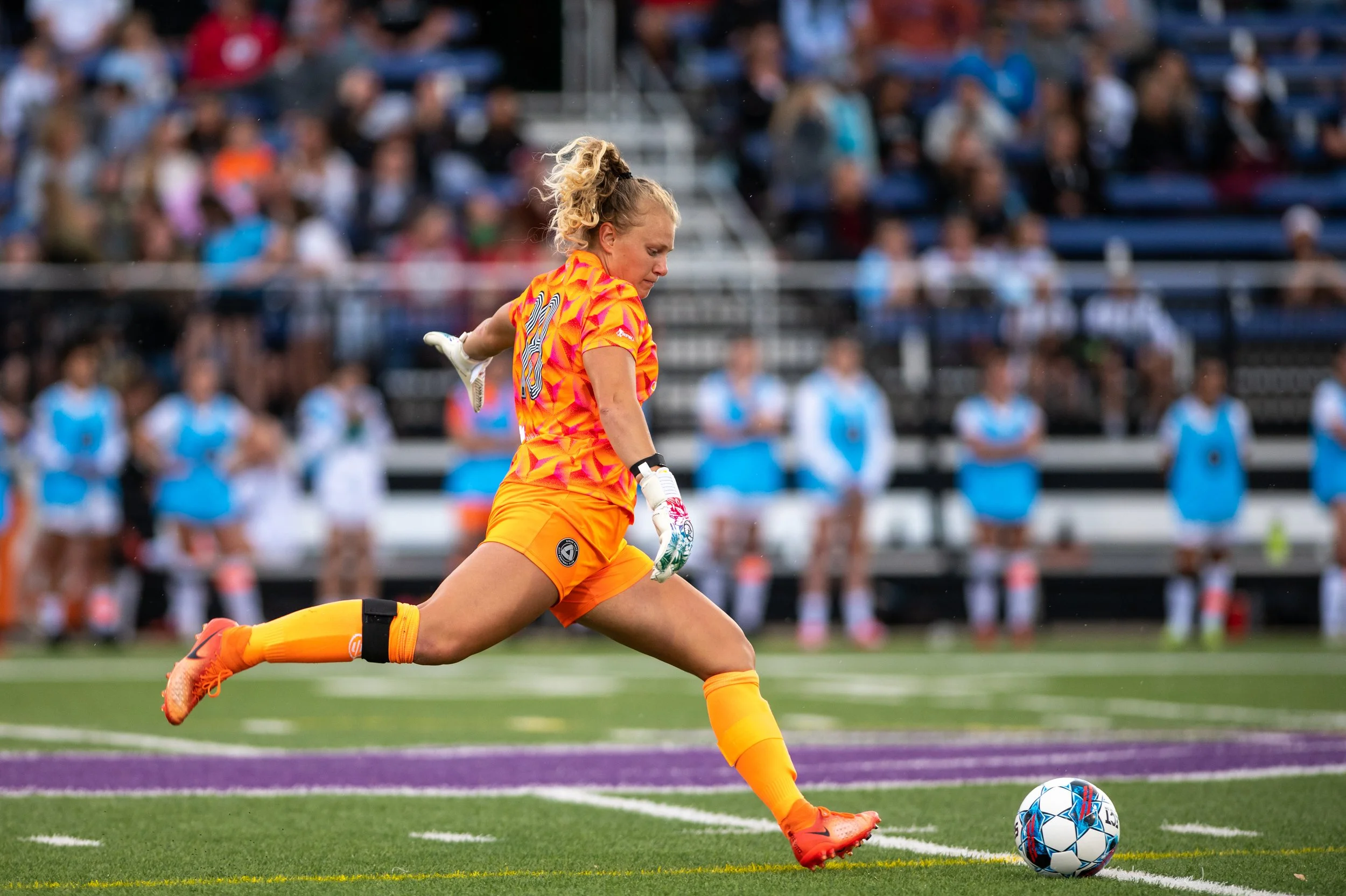
For the goalies I wanted to make sure we drew visual cues from the crest in fresh and dynamic ways. Vibrant and saturated colors were used for these colorways, adding a lot of energy to the club’s number 1.


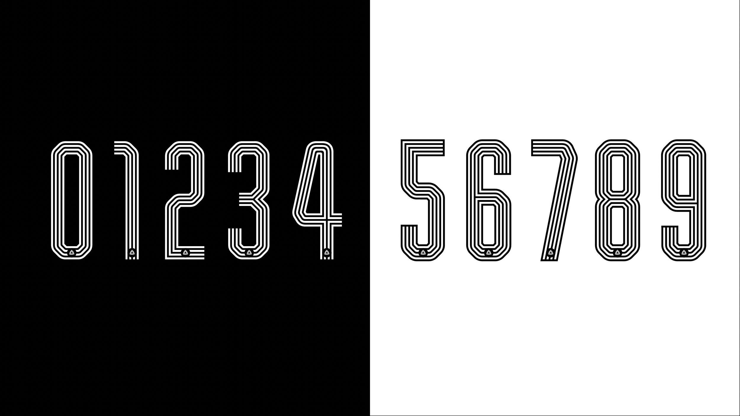
The numbers continue the crest’s linear language with a simplified version of the antibadge added as an authenticity mark.
Supporting graphics were created for fanwear, social media, and branding.


I created templates for their social media to save the club precious time and ensure brand consistency.


